Tom Chantrell Poster Artist
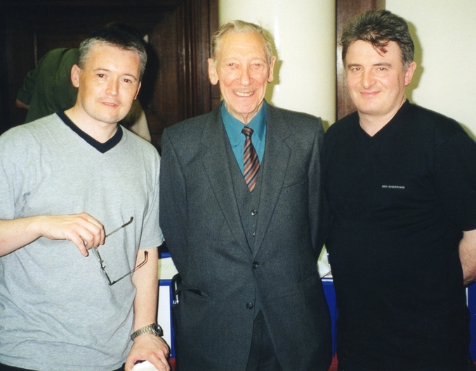
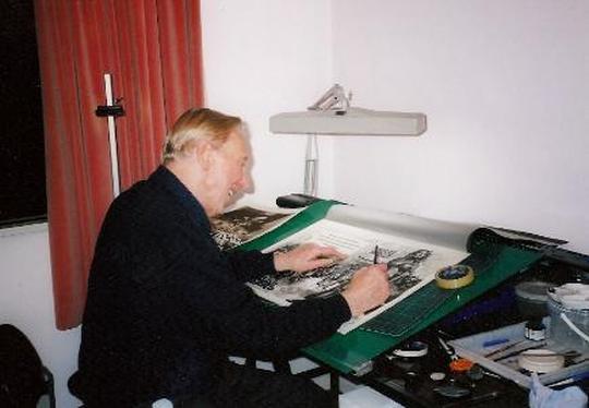
Dave, Tom Chantrell and Sam in London 2000
Meeting Tom Chantrell
We were introduced to Tom Chantrell at a London film fair in September 2000 and chatted away for a couple of hours about his career. After posing for a couple of photos, Tom gave me his phone number and I phoned him a few times in late 2000. Knowing I was a poster collector, he was more interested in the pricing of posters, why some were so expensive, what made them collectible and why nobody was buying his artwork. I tried to explain that most poster collectors didn’t collect artwork and could barely afford the posters. At the time Tom Chantrell had a list of posters and original artwork that he was trying to sell and I kick myself now for not buying more but I just didn’t have the money. I did manage to get a short interview out of him, its not much but here it is.
A chat with Tom Chantrell
Dave– The first poster you produced was in 1938
Tom– Yes, ”The Amazing Dr Clitterhouse” , I had only just got started on posters when the war came along. I ended up in bomb disposal.
D– I have always wanted to know but they did have 30x40 horizontal quads back in the 30s because collectors aren’t to sure when they started.
Tom– Oh yes, definitely in the 30s.
D– After the war you worked on titles like “Brighton Rock”
Tom– You know I did a self portrait, with me working on “Brighton Rock” and I look a bit like the way Richard Attenborough looks on the poster.
D– You then did a lot for 20th Century Fox. and Warner Bros.
Tom– I did a lot of the Marylyn Monroe’s and I was the first to put Elvis Presley on posters here.
D– On one of the Elvis posters you play about with the famous Chantrell signature by having your signature jiggling about a bit like Elvis.
Tom– I used to do this sometimes, just a bit of fun, there’s a poster were my name is upside down because the film was set in Australia.
D– I think that might be “The Sundowners” and you did the same on “The Nanny” with a wavy signature.
Tom– That’s because your seeing it from under the water.
D– Sometimes you didn’t sign the artwork, why was that?
Tom– Well sometimes there just wasn’t enough room but to be honest a lot of the time I just forgot. You know I forgot to sign the artwork for “Star Wars” and they weren’t very happy because they had asked for me and I think they wanted my name on it. So they got me to sign about half a dozen bits of paper and these were sent out all over the world so that an artist could put my name on by hand. It was all very funny.
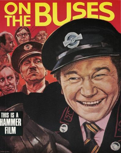
D– By the mid 60s you were doing a lot of the “Carry ons” and “Hammer” and you got into a bit of trouble with “Carry on Cleo” and “Carry on Spying”.
Tom– The people who made the “Bond” films objected to “Carry on Spying” because it was similar to one of their posters but I got away with that one. I remember there was something to do with the gun barrel because I had to straighten it or bend it or something because I had it tied in knots and that was rejected so I had to change it. The poster for “Carry on Cleo” was definitely pulled and I still don’t know why. They said I copied “Cleopatra”, it was a send up but all of the posters had to be destroyed, I still managed to keep a few though.
D– What was it like working for “Hammer” and James Carreras.
Tom– I worked next door to them and got on very well, it was a busy time and did a lot of work for “Hammer”. I was sometimes working on 5 posters at one time.
D– That would be the “Warner-Pathe” double bills, you had the double bill, two full quads and a couple of double crowns. The silk screen posters weren’t very attractive, what was the point of doing them when you had a full colour poster.
Tom– I think somebody at “Warner-Pathe” had a brother in law who owned a printing works. The artwork for those posters were done in black and white and the colour added in at the printing process.
D– One of my favourite posters is “One Million Years BC” do you still have the original artwork for that.
Tom– Well no, the artwork of Raquel Welsh was reused when they reissued it with “She”.
I simply cut her out and stuck it on to the new artwork, but I did do completely new artwork for Ursula Andress. Raquel Welch sent her husband round , I think it was her husband, but she wanted me to do all of her posters from then on.
D– But why cut out such a lovely piece of artwork and reuse it.
Tom– Just to save time.
D– “Dracula Prince of Darkness” quad is unsigned but that is your work.
Tom– Yes that’s one of mine. Do you know that is me on “Dracula Has Risen From The Grave” and not Christopher Lee.
D– Why’s that?
Tom– Couldn’t get any good photos of Christopher Lee, so I just posed myself with my fists clenched, it looks ok.
To be honest I’d rather draw the ladies, I was always better at drawing women, just loved them.
D– You should write a book on all of this.
Tom– I’am afraid I’m not very interesting. I think someone was wanting to do a book on me and have an exhibition of my work but I haven’t heard anything else about it.
I was hoping to meet up with Tom Chantrell in 2001 and record a much longer interview but sadly Tom Chantrell died in July 2001.
I’am glad I got the chance to meet and talk with him.
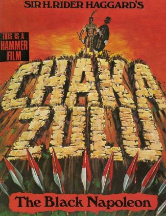
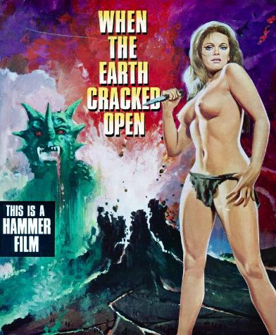
Tom Chantrell was born in Manchester in 1916, apart from working on the Hammer posters already mentioned on this site he worked on posters for a lot of very good films. Six of the best “Carry On” movies, along with “Star Wars”, “Bullitt”, “Bonnie and Clyde”, ”Love Me Tender”, “Bus Stop”, to name but a few. Ironically he also did the British design for “Cleopatra” a couple of years before getting into trouble over his parody of the American poster for the movie.
Very few poster artists were regarded as highly among collectors as Tom Chantrell and when I met him I said that I had always wanted to meet the man behind the famous Chantrell signature to which he replied- “ I must be a bit of a disappointment”
I can honestly say after all of these years, no not a disappointment at all.
A chat with Tom Chantrell
Dave– The first poster you produced was in 1938
Tom– Yes, ”The Amazing Dr Clitterhouse” , I had only just got started on posters when the war came along. I ended up in bomb disposal.
D– I have always wanted to know but they did have 30x40 horizontal quads back in the 30s because collectors aren’t to sure when they started.
Tom– Oh yes, definitely in the 30s.
D– After the war you worked on titles like “Brighton Rock”
Tom– You know I did a self portrait, with me working on “Brighton Rock” and I look a bit like the way Richard Attenborough looks on the poster.
D– You then did a lot for 20th Century Fox. and Warner Bros.
Tom– I did a lot of the Marylyn Monroe’s and I was the first to put Elvis Presley on posters here.
D– On one of the Elvis posters you play about with the famous Chantrell signature by having your signature jiggling about a bit like Elvis.
Tom– I used to do this sometimes, just a bit of fun, there’s a poster were my name is upside down because the film was set in Australia.
D– I think that might be “The Sundowners” and you did the same on “The Nanny” with a wavy signature.
Tom– That’s because your seeing it from under the water.
D– Sometimes you didn’t sign the artwork, why was that?
Tom– Well sometimes there just wasn’t enough room but to be honest a lot of the time I just forgot. You know I forgot to sign the artwork for “Star Wars” and they weren’t very happy because they had asked for me and I think they wanted my name on it. So they got me to sign about half a dozen bits of paper and these were sent out all over the world so that an artist could put my name on by hand. It was all very funny.
D– By the mid 60s you were doing a lot of the “Carry ons” and “Hammer” and you got into a bit of trouble with “Carry on Cleo” and “Carry on Spying”.
Tom– The people who made the “Bond” films objected to “Carry on Spying” because it was similar to one of their posters but I got away with that one. I remember there was something to do with the gun barrel because I had to straighten it or bend it or something because I had it tied in knots and that was rejected so I had to change it. The poster for “Carry on Cleo” was definitely pulled and I still don’t know why. They said I copied “Cleopatra”, it was a send up but all of the posters had to be destroyed, I still managed to keep a few though.
D– What was it like working for “Hammer” and James Carreras.
Tom– I worked next door to them and got on very well, it was a busy time and did a lot of work for “Hammer”. I was sometimes working on 5 posters at one time.
D– That would be the “Warner-Pathe” double bills, you had the double bill, two full quads and a couple of double crowns. The silk screen posters weren’t very attractive, what was the point of doing them when you had a full colour poster.
Tom– I think somebody at “Warner-Pathe” had a brother in law who owned a printing works. The artwork for those posters were done in black and white and the colour added in at the printing process.
D– One of my favourite posters is “One Million Years BC” do you still have the original artwork for that.
Tom– Well no, the artwork of Raquel Welsh was reused when they reissued it with “She”.
I simply cut her out and stuck it on to the new artwork, but I did do completely new artwork for Ursula Andress. Raquel Welch sent her husband round , I think it was her husband, but she wanted me to do all of her posters from then on.
D– But why cut out such a lovely piece of artwork and reuse it.
Tom– Just to save time.
D– “Dracula Prince of Darkness” quad is unsigned but that is your work.
Tom– Yes that’s one of mine. Do you know that is me on “Dracula Has Risen From The Grave” and not Christopher Lee.
D– Why’s that?
Tom– Couldn’t get any good photos of Christopher Lee, so I just posed myself with my fists clenched, it looks ok.
To be honest I’d rather draw the ladies, I was always better at drawing women, just loved them.
D– You should write a book on all of this.
Tom– I’am afraid I’m not very interesting. I think someone was wanting to do a book on me and have an exhibition of my work but I haven’t heard anything else about it.
I was hoping to meet up with Tom Chantrell in 2001 and record a much longer interview but sadly Tom Chantrell died in July 2001.
I’am glad I got the chance to meet and talk with him.
Tom Chantrell was born in Manchester in 1916, apart from working on the Hammer posters already mentioned on this site he worked on posters for a lot of very good films. Six of the best “Carry On” movies, along with “Star Wars”, “Bullitt”, “Bonnie and Clyde”, ”Love Me Tender”, “Bus Stop”, to name but a few. Ironically he also did the British design for “Cleopatra” a couple of years before getting into trouble over his parody of the American poster for the movie.
Very few poster artists were regarded as highly among collectors as Tom Chantrell and when I met him I said that I had always wanted to meet the man behind the famous Chantrell signature to which he replied- “ I must be a bit of a disappointment”
I can honestly say after all of these years, no not a disappointment at all.
The Following photos were taken by Simon Greetham at Tom Chantrells home in 1998 and are (C)Simon Greetham. Featured are some of Tom Chantrells original
artwork and designs.
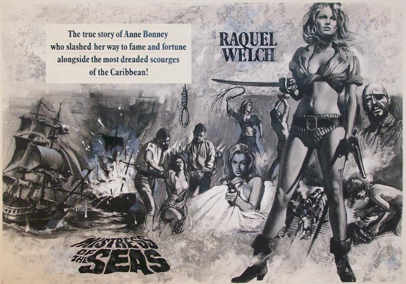
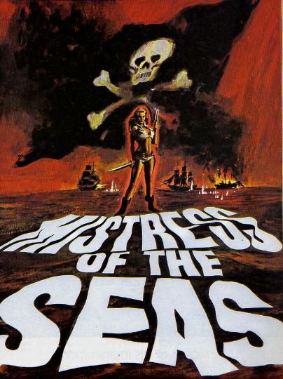
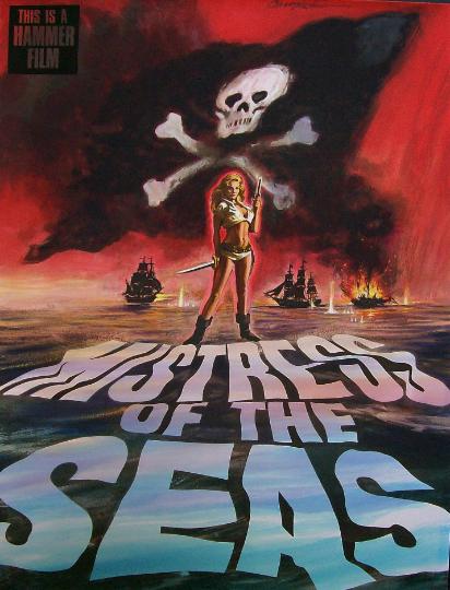
Tom Chantrell posing with the "Mistress of the Seas"
original artwork.
Simon Greetham talks about "Mistress of the Seas"
"Its interesting to note this is the original master
artwork that was used in the large format brochure
produced by Hammer to stir up interest in the project.
As you can see from the pics the paint / ink has been
applied to a proof copy of the original pencil and ink
drawing. I asked Tom about this, he said that this was
common practise by him and several copies were run
off by Tom himself and various colours would be tried
out on each copy. The final copy ( which this is ) then
had a wash applied using a clear gel sheet with the
colour applied, this was then laid over the art work and
a print taken, this artwork forms the central pages of
the promotional brochure. Tom told me that Raquel
Welch had been approached to take the lead role
( shame it never made it to screen)".
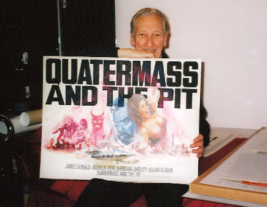
Tom Chantrell with the original artwork for "Quatermass and the Pit".
License was only given for use of his artwork on the
original release of the film and for promotional use,
i.e press books, pre publicity etc. Tom successfully
took companies to court who used his artwork when
the introduction of videos came about and video
distributors used his art work on there publicity /
video covers. He also stated in his letter that the
original artworks were to be returned to him".
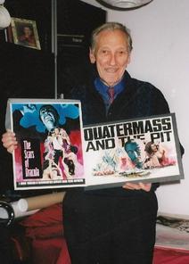
Tom Chantrell with the preproduction artwork for "Quatermass and the Pit" showing John Neville in the lead.
The preproduction art for "Scars of Dracula" seems to have been quickly put together from previouly used artwork from "Dracula Has Risen From The Grave" and "Taste the Blood of Dracula" trade ad art.
Several pre-production artworks were quickly put together for "The Scars of Dracula" using designs from previous "Dracula" films in order to encourage financial backing from EMI.
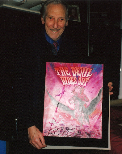
Tom Chantrell with his original pre-production artwork for "The Devil Rides Out". Photo (C) Simon Greetham
|
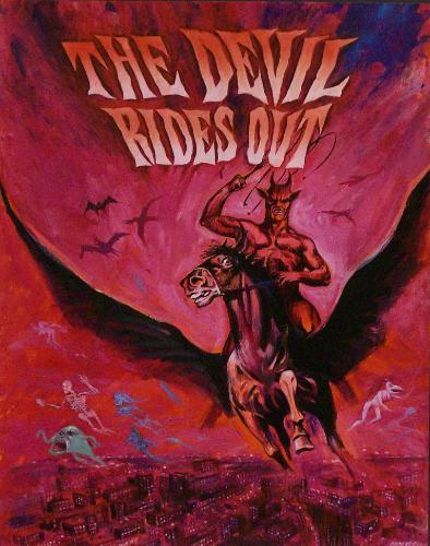
Tom Chantrells original pre-production artwork for "The Devil Rides Out".
|
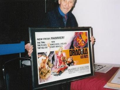
Tom with the art for "Dracula AD 1972" he also did the poster for "The Satanic Rites of Dracula" and Simon explains why Christopher Lee has his arms raised. "Tom did do a superb alternate Satanic Rites of Dracula, same poster but he had Dracula holding a knife in one hand and a dead cockerel in the other, Tom submitted this design but was asked to remove the knife and cockerel due to the black magic / voodoo element, Hammer asked Tom to just show Lee with the raised arms. Tom always said to me it was just as though he had scored a goal".
|
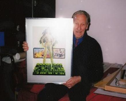
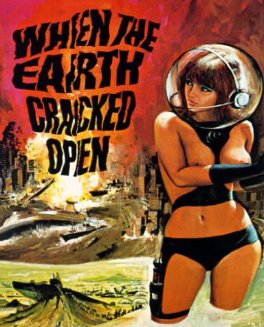
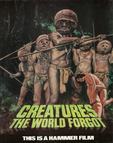
Tom Chantrell with the original preproduction artwork for "Creatures the World Forgot" with futuristic planes and spacesuits. I would love to know what storyline Tom Chantrell was shown because this is not what eventually appeared on the. screen.
|
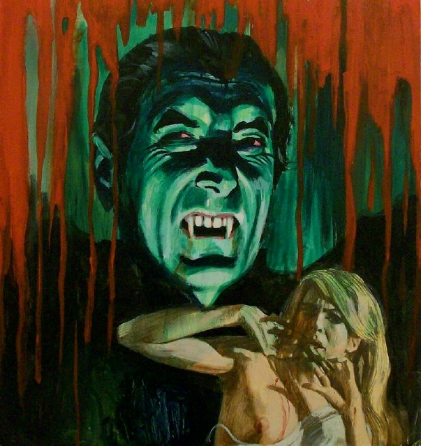
Tom Chantrells original preproduction artwork from "Taste the Blood of Dracula".
|
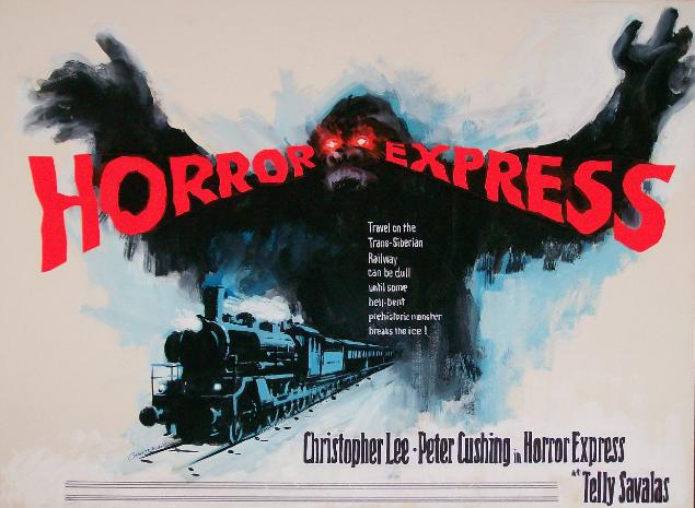
Tom Chantrells unused quad design for "Horror Express".
|
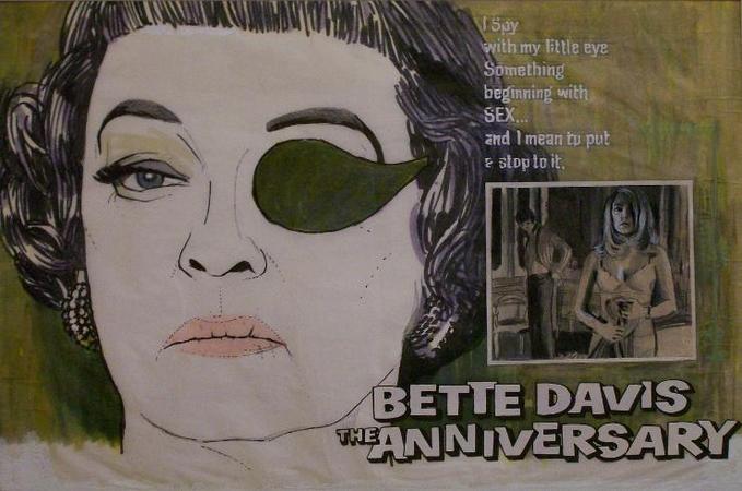
Tom Chantrells original artwork for Hammer's "The Anniversary". This is Chantrells final rough design that was sent to Hammer for their approval, from this a much more detailed artwork would be prepared and used on the British quad poster. The image on the right of the two lovers is a pencil sketch showing where a photo was to be inserted on the printed poster.
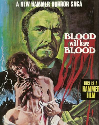
Some preproduction artwork from Hammer films by Tom Chantrell although most of the release posters would be done by other artists. "Blood Will Have Blood" shows Eric Porter on the poster but he pulled out and was replaced by Robert Hardy.
This title waslater changed to "Demons of the Mind" and this was the poster that lead to a major bust up between Michae Carreras and his father James Carreras. Michael wanted to use the art on the poster, but his father sided with EMI to use a photographic design.
It is a shame that these designs were never used on the release posters, now for the first time some of them can be seen thanks to Simon Greetham who received these flyers from Tom Chantrell.


All original artwork and designs are (C)Tom Chantrell.
Unfilmed Hammer Posters
It is thought that there were around 80 or more unfilmed Hammer projects but the number is probably a lot higher and we will certainly never know the full number. With the help of Simon Greetham a long time fan of Tom Chantrell's work we can now see a small number of the preproduction artworks prepared by Tom Chantrell for Hammer. Even though Tom Chantrell sold off much of his original work in later years he still retained full copyright on his artwork. All artwork (c) TOM CHANTRELL.